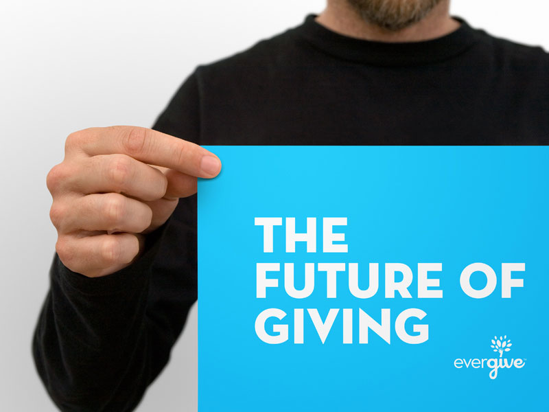
Branding Evergive, a Mobile Fundraising App
We were approached a few months back about working with a technology startup in San Francisco to develop the logo and branding package for their newly named mobile fundraising app called Evergive. They already had a great idea, but they realized their old name (Paystik) didn’t properly convey who they were and what their driving ethos was. The core idea behind their giving app is that of planting something today that will grow over time. They were looking for a more holistic approach to their branding to help donors and partners feel like they are making a difference. The idea of planting something good and embracing the continuity of giving.
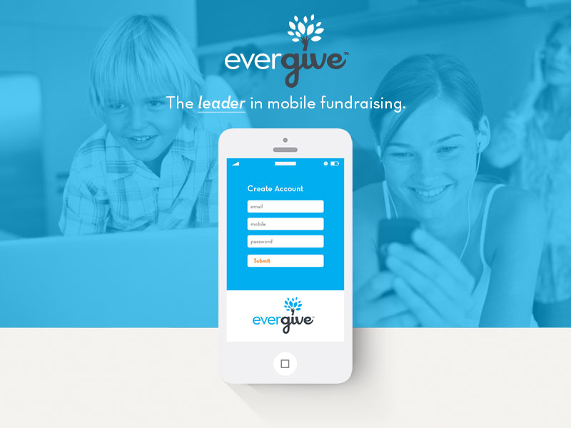
Enter Evergive, formerly known as Paystik. Put simply, Evergive has positioned themselves as the leader in mobile fundraising. They couple cutting edge mobile technology with a reimagined fundraiser and donor experience. With Evergive, nonprofits can raise more money and build stronger relationships, while donors feel more engaged and confident in their giving. More simply put, Evergive makes it easy for organizations to give and receive.
Concept
The goal of the project was to keep it from feeling that it could be “any” sort of payment or transactional system that is too generic and not specific. We wanted avoid being too focused on the transactional nature of the giving process, and instead, focus more on providing a holistic platform between the donors and organizations.
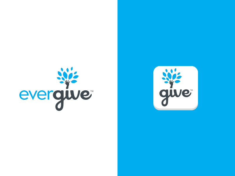
During our discovery process, the client revealed they liked the idea of “planting something today that will grow over time”. From there, we were able to move towards the idea of a “giving tree” type of mark that was more representational of the ethos behind their product.
The Mark
The challenge was making sure the mark stayed on point with the actual service the client was providing. For example, we asked questions like would somebody confuse them with a nature or environmental group out of context with their sales or other supporting materials? Context is always key when telling a story, so knowing and having them reassure us that there will always be the context of users being led to their service and having it explained, we were able to explore options for the mark that were not overtly technical and transactional focused in regards to being a mobile fundraising app. We understood the understory and company ethos of giving with the holistic approach, but didn’t want it to be a disconnect if somebody found them without context.
In the end, we were able to achieve a meaningful, memorable and clear logo mark that provides the brand with a holistic approach to giving with delightful ease.
Typography
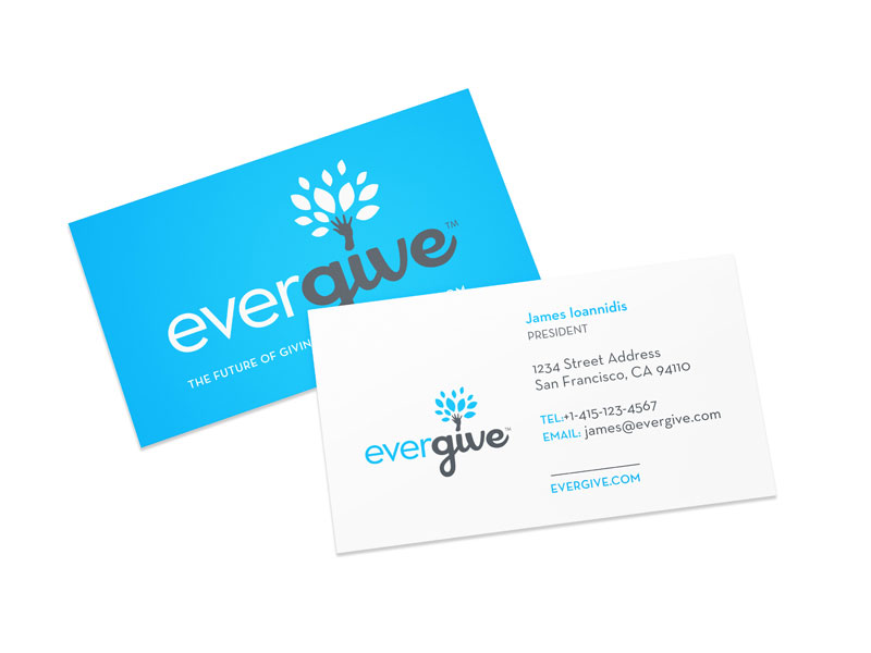
The typography chosen for this brand is a combination of Neutraface and Cocktail Shaker. The client really wanted to emphasize the GIVE portion of their name and anything we could do to give more distinction between the two words making up their name.
Within our final mark, Neutraface resonates a holistic unity as it is paired up with Cocktail Shaker to present a balanced logotype with uncompromising functionalism.
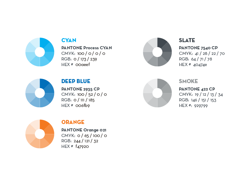
Color
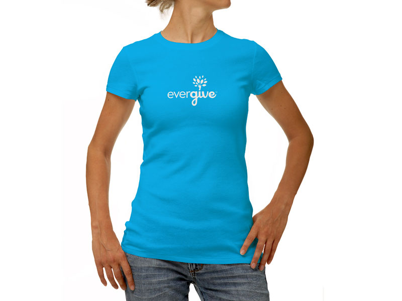
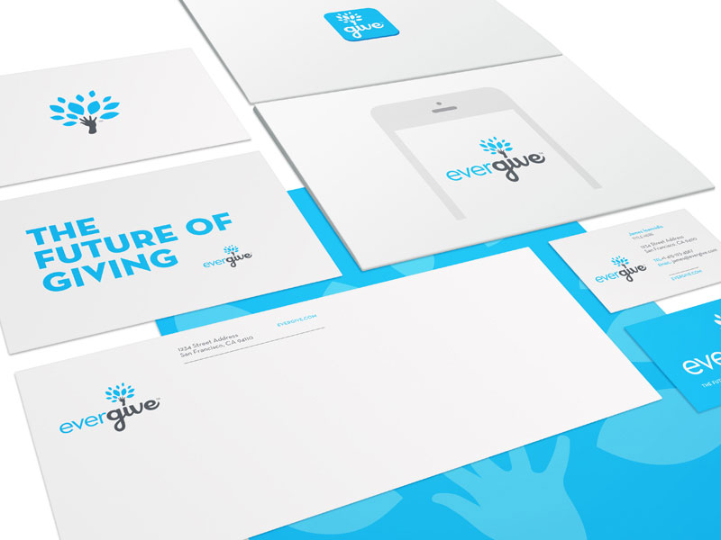
The color system of the Evergive brand identity is confident, engaged and trustworthy. The simplicity of the palette allows the brand to speak with confidence without the colors detracting from the voice. Instead, the colors reinforce the dependability of the brand. A distinct choice of blue has been designated as the primary color to represent Evergive. A palette of grays, blues and oranges have been chosen to represent contrast.
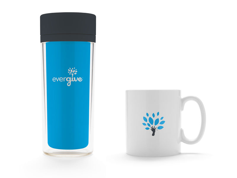
The Final Product
Both parties could not have been happier with the final outcome. We were able to accomplish the initial goals of a holistic design that communicates the delightful ease of giving within their mobile platform.
A Happy Customer
“We had a great experience working with Brand Aid on our upcoming brand re-alignment. Jeremy and his team crafted our vision, our values, and the tablesakes of our industry into a visual system that got our entire team excited. Throughout the process he was very responsive and attentive to our feedback and went above and beyond in deliverables – I highly recommend Brand Aid to others.”
~ James Ioannidis, CEO at Evergive
 July 2, 2014
Impressive work! My immediate impression of the brand is of optimism and growth. It’s simple, clean, and yet still unique–not an easy task but you arrived at it beautifully. Bravo!