Branding StoryBox, a Social Media Software Company
We are proud to announce the launch of VideoGenie’s new rebranding transition to StoryBox, along with their newly redesigned website! After several months of hard work, we’re thrilled to unveil the new design.
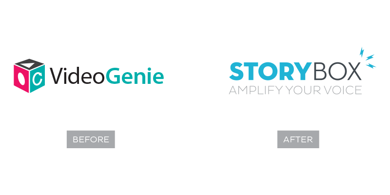
After nearly five years being known as VideoGenie, the company reached a point where it had outgrown its name. While memorable and unique in the competitive set, the name suggested too narrow of a focus on video and did not sufficiently portray the company’s new value proposition and vision.
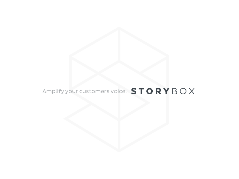
The newly named, StoryBox, better communicates the company’s breadth of expertise, and suggests how the company empowers clients to use their customers’ stories – instead of internally-created ones – to build a richer, and more authentic brand story.
Starting out, the leadership team gave us a blank canvas to work from and really wanted to see how far we could push the values and vision surrounding their new name. They had outgrown the color palette for the existing logo as it wasn’t easy to compliment with other applications and uses. They also felt the video cube was too hard to use in smaller situations as the icons became indecipherable and meaningless.
SparkBox Concept
Knowing that part of the brand personality for the company was “playful” and “lighthearted”, we began the process seeing where we could naturally transition from their current video cube to be a softer, more approachable and colorful “sparkbox” that presented itself as more playful and lighthearted. We did a lot of heavy work around the sparkbox concept by working with a more simple, rounded and casual execution of the box and the ideas of speech, communication and action surrounding it.
![]()
While the team felt this was a production ready concept that they could easily move forward with, they weren’t settled with keeping the literal box from their original mark, and were eager to see how far “outside of the box” we could go to visually represent the idea of storytelling and getting a customers message across through their platform.
SoapBox Concept
One thing that kept coming up in our discussions was the idea of a “soapbox” where you figuratively have something to step on, to preach or shout out your message. The soapbox platforms from days of old were intended to give them further reach and to amplify their voices.
Originally, they liked the idea of trying to come up with a type of character that could represent the brand and convey the concept of amplifying your voice through the storybox platform. After deciding our soapbox man in the first round of illustrations came across as too aggressive and shouting at the customer instead of trying to relate a story or be conversational and helpful, we proceeded to try and refine the illustrations to keep our guy more approachable and friendly. We tried to think of other ways to represent storytelling through sound and one of the concepts that came out was that of whistling. Afterall, who doesn’t like a good looking British looking chap whistling a good tune!
We played around a lot with different shapes and objects that could fill in the eye for interest and present itself as more bold, memorable and unexpected. The final monocle man concept below helped soften the mark and make the overall illustration softer and more approachable.
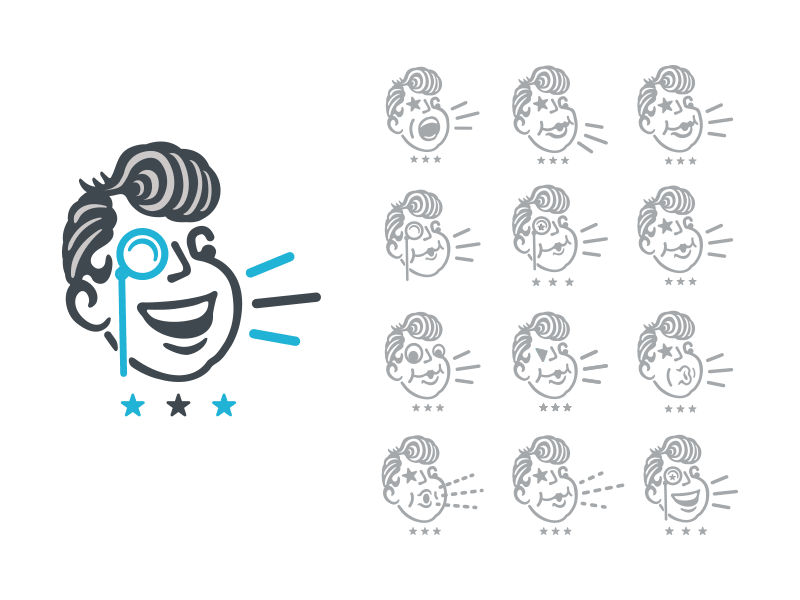
Since the StoryBox team loved the “Monocle Man” execution so much, they decided to pause and take surveys on the logos and see what kind of feedback they could receive. First, they ran them by key clients who have been with them a while. Then they ran them by key investors and advisors who came to a unanimous decision for them to eliminate the talking “soapbox” head. They felt it was too casual and distancing from where they needed to be. Even though StoryBox is a fun, outgoing and cutting edge company to work with, their advisors felt it was time to mature a little bit in their presentation, and this execution was too playful and whimsical for the image they needed to portray.
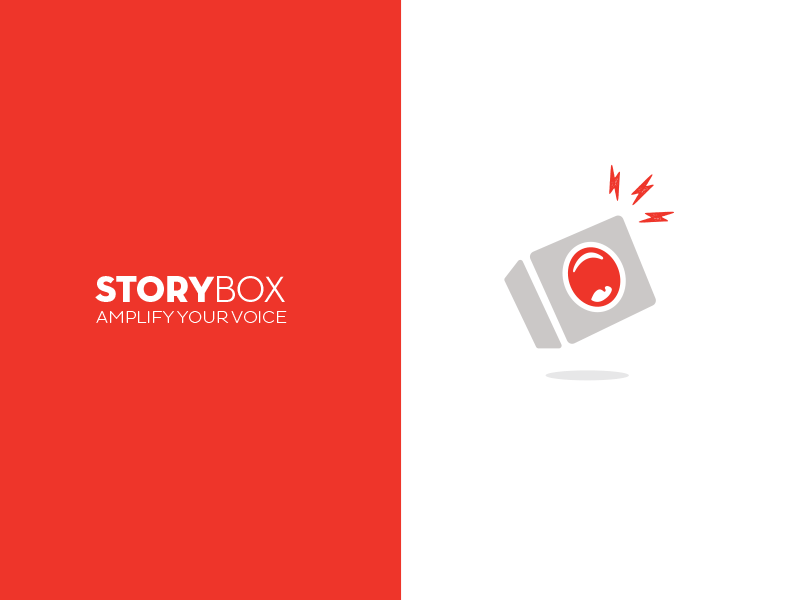
AmplifyBox Concept
Still wanting to push the soap box concept further, we worked with the idea of a speaker or an actual “amp” which we know as a box for transmitting sound. We gave the box or “amp” a mouth to tell the story with, thus playing on the concept of “Amplify Your Voice”. We also introduced used some lightning bolts to give a sense of energy and power around the storytelling.
In the end, the red with the combination of the mouth came across as too harsh and gave the conveyance of screaming at a concert.
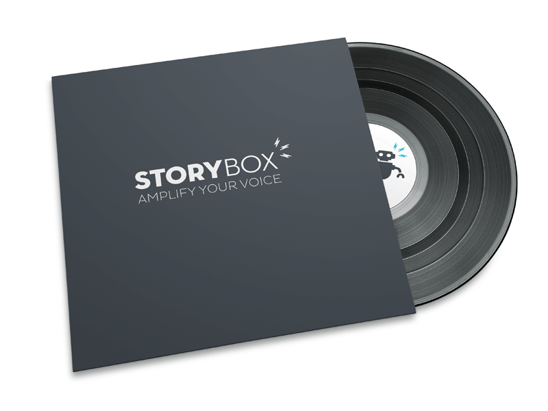
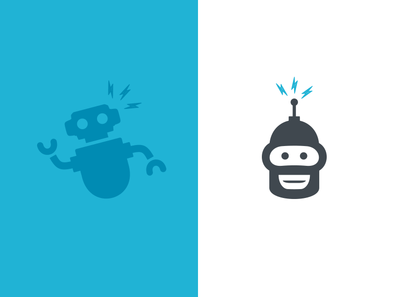
StoryBot Concept
In some of our early discussions the idea of having an actual character or “mascot” came up so we proceeded to develop the Story “BOT” concept as a play on words utilizing a character or mascot to be the voice. All human stories are narrated and represented by a “voice” in some fashion, so we chose to use the quirky and playful “BOT’ concept to be that representation. The “BOT” also plays more into the technical nature of the service. Being able to see such a wide and varied representation of concepts and styles really helped the internal team answer the questions of who do we see ourselves as and who does the customer see us as.
At the end of the day, they decided they needed to move away from the rigid technology association with their service and be more about the people and stories being represented by the technology, and not highlighting the technology aspect of the service itself.
ShapeBox Concept
Per the clients request, they wanted to see one final round to see how much further we could push additional concepts to make sure we left no stone unturned. The resulting concept is an implementation we called the “ShapeBox”. Some feedback they received from their board of directors centered around wanting to see what we could come up with that was a little more cutting edge, contemporary, sleek, and pushing the edge of technology.
We decided to take the abstracted form of their original “box” and construct it to reveal an “S” mark composed of the box elements. We also opened the font out a bit more to let it breathe. We wanted to keep this one black and white to focus more on the mark, and not the color story, helping give it a more modern and corporate feel.
After being able to compare this direction with their value statement of who they really were as a young, vibrant, real and authentic company, they felt this went beyond who they are and came across as more fitting for an industrial design or technology firm. It was too complex of a mark for the simple and approachable brand personality they were going for and where they needed to be.
![]()
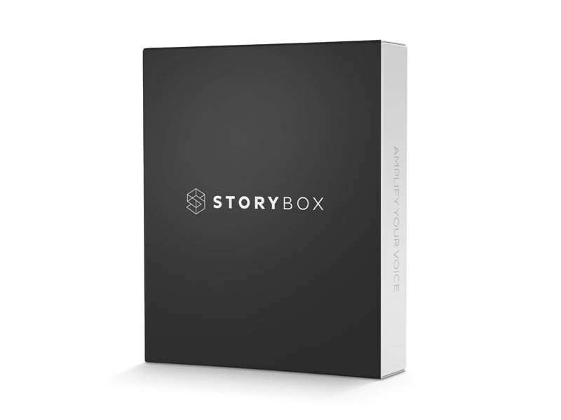
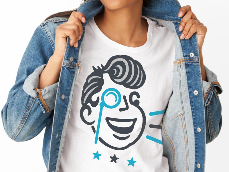
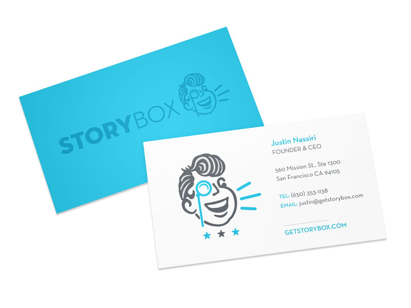
Final Mark
The challenge in the end was making sure the mark stayed on point with their company goal of highlighting the customers stories over their own.
The one consistent trait of all the branding rounds was the typography. They felt the typographic mark by itself helped take the limelight away from them as a white label technology platform, helping make their clients stand out and not themselves. They also really loved the application of the lightning bolts to the typography and wanted to keep them paired together as it was an homage to their innovative and dynamic platform for empowering their clients to use their customers’ stories – instead of internally-created ones – to build a richer, and more authentic brand story.
In the end, we were able to achieve a meaningful, memorable and clear logo mark that presents a proven and reliable brand personality to their existing and target customer base.
![]()
![]()
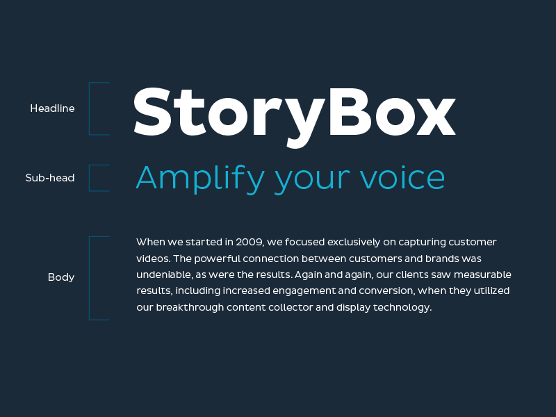
Typography
The typography chosen for this brand is a combination of Neutraface and Pluto Sans, which they felt were right on point with their target messaging – steady, reliable, corporate and approachable, but still holding a modern and tech-centric feeling to it.
Within our final mark, Neutraface resonates a holistic unity as it is paired up with Pluto Sans, hinting at the friendly and approachable voice StoryBox aimed to achieve within their logotype.
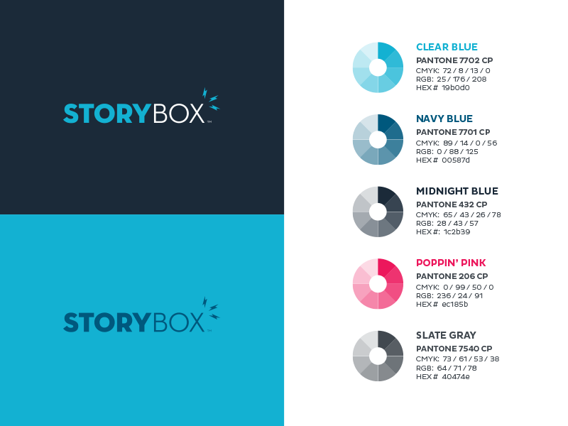
Color
The color system of the StoryBox brand identity is proven and reliable. The simplicity of the palette allows the brand to speak with confidence, without the colors detracting from the voice. The colors also reinforce the dependability of the brand. A distinct choice of lighter blue has been designated as the primary color to represent StoryBox complemented by a palette of grays, darker blues and pinks to provide contrast and call to action indicators within their software and web platforms.
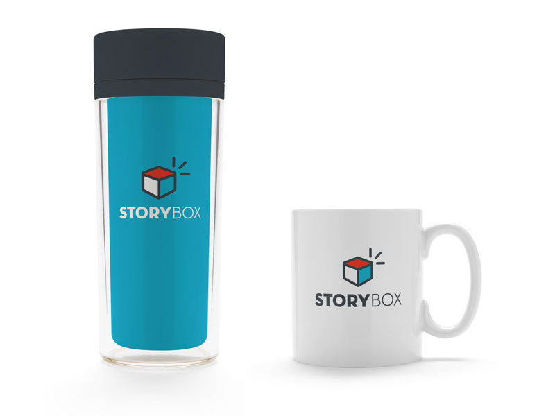
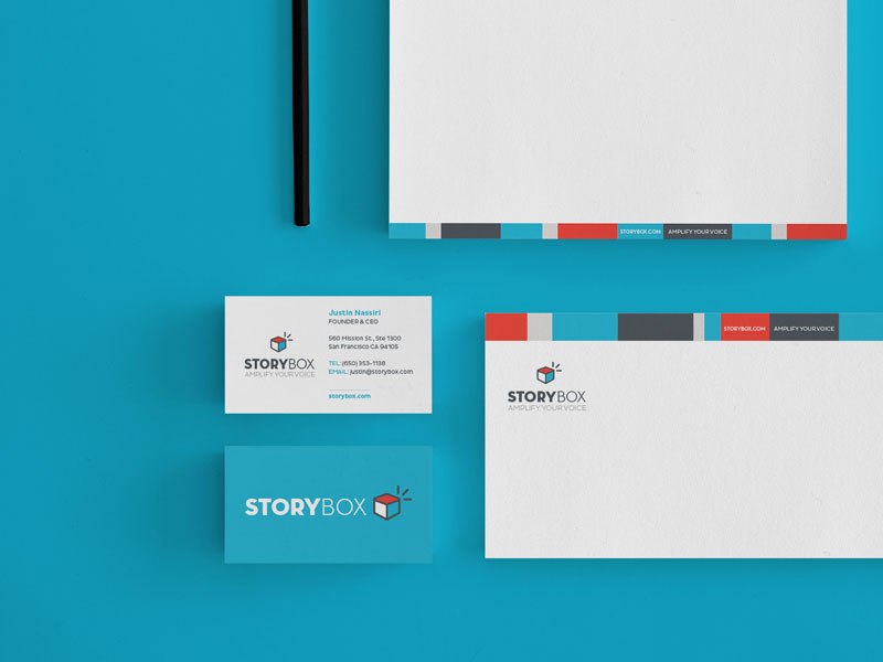
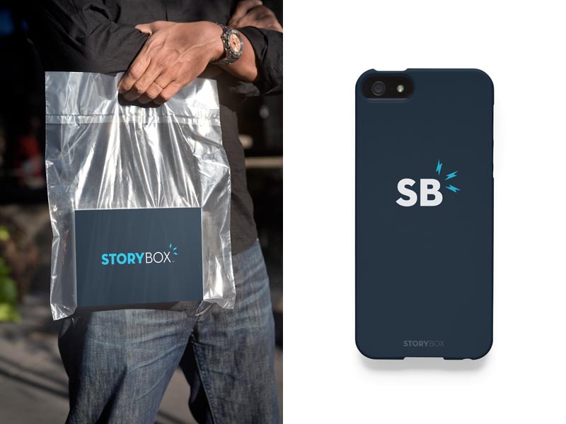
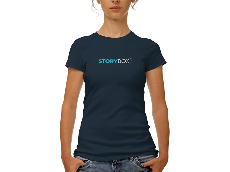
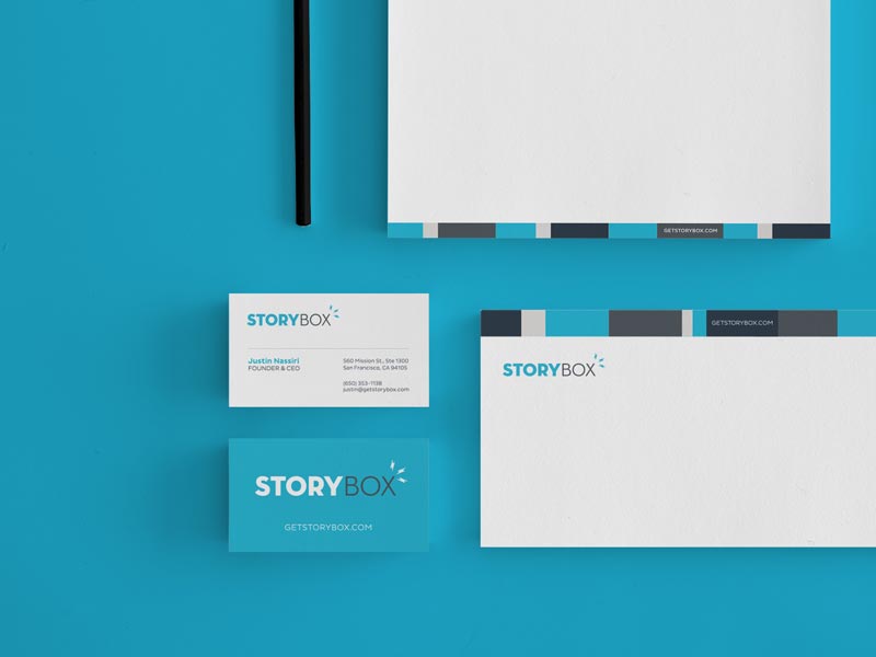
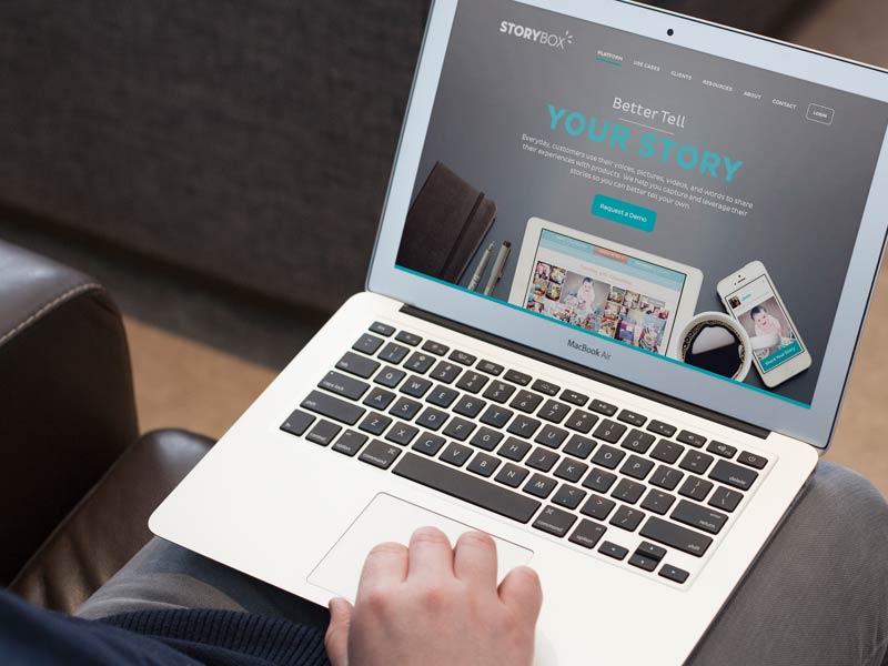
Final Application
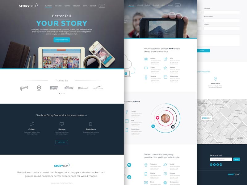
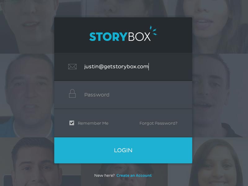
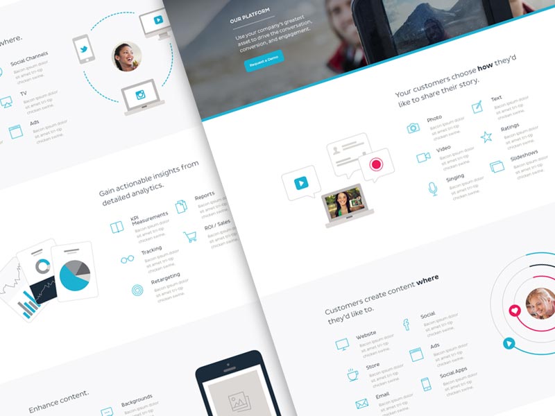
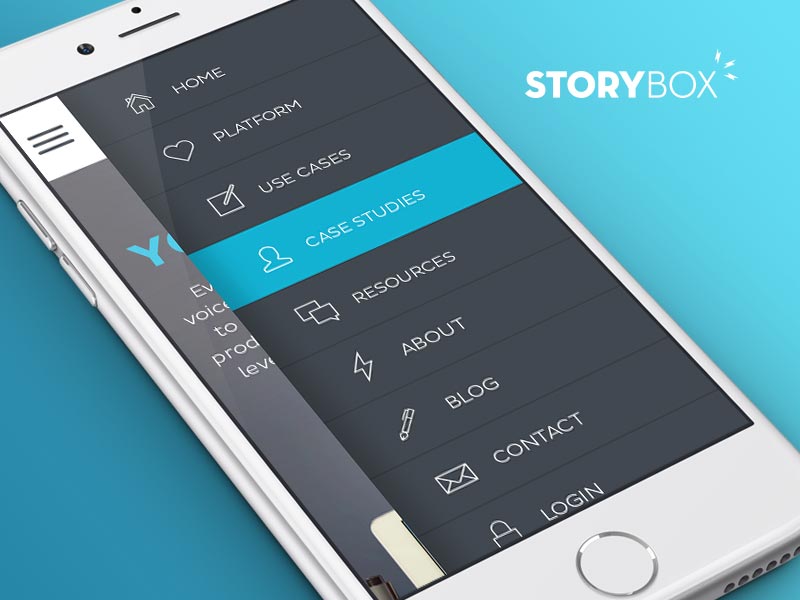
Both parties could not have been happier with the final outcome. We were able to accomplish the initial goals of a simple and approachable mark that communicates the proven and reliable product offerings within their social media marketing software platform.
At the end of the day, we crafted a custom built responsive website, using WordPress as the CMS engine behind this beautifully engaging platform that highlights their customer stories and gives an in depth view of real world use cases and additional product offerings.
A Happy Customer
“Brand Aid is really incredible – collaborative, responsive, creative geniuses, and all around nice guys. I would work with the Brand Aid team any day.
Brand Aid headed up our work on our company logo design, website design and development work. We interviewed countless agencies when we were deciding on a vendor, and from minute one Brand Aid stood out from the rest. They were empathetic, quick to understand and make a connection, and their passion made us realize that they are the type of guys who will absolutely devote themselves to and pour into any project they take on.
Neither the logo redesign nor the website process were simple projects. My team and I frequently changed opinions and directions, as this was a major step for us as a company. With each of these changes, Brand Aid was able to pivot with us, add to the discussion, and be part of the brainstorming process. We quickly got into a cadence where I valued their advice and counsel as if they were full time members of the team. I have never had that happen before with a vendor.
Another thing that set Brand Aid apart is their extreme devotion to the project. We would trade calls, emails and notes 7am to 7pm. I have to juggle so many tasks throughout the day, it gave me a lot of comfort to know that they were always on the ball, making sure we were on track, and meticulously tracking the thousand different to-do items that needed to get done.
Lastly, the team at Brand Aid have unquestionable integrity. I never doubted their intentions, and always knew that they would do the right thing. This made a major difference in a very time sensitive project, with lots of potential pitfalls.
I look forward to working with these guys again – it was a lot of fun!”
~ Justin Nassiri, Founder & CEO of StoryBox
Special Thanks
A huge shout out to Katherine Glass at SpringMark Branding for her stellar discovery and brand positioning work on this and for bringing us onboard to partner with her and the fine folks at StoryBox on developing their new branding.
 March 26, 2015
Very impressive Jeremy – love the designs and thought that went into each stage.